Sketch Faster, Think Clearer on Your Tablet
Welcome to a hands-on exploration of digital sketchnoting tools and workflows for tablets and styluses. Discover how the right hardware, apps, and repeatable habits turn messy ideas into clear visuals in real time. Whether you facilitate workshops, take lecture notes, or map strategy, you will find practical guidance, stories, and templates. Jump in, try exercises, share questions, and subscribe to keep sharpening your visual thinking practice.
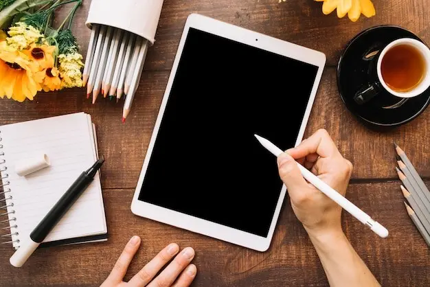
Choosing the Right Hardware
Hardware choices quietly shape every line you draw, especially after long sessions of focus. Screen size affects handwriting comfort and readability; latency and pressure response influence confidence; palm rejection, tilt support, and nib texture change flow. Balance portability with canvas size, consider battery longevity, and test matte screen protectors for paper-like friction. After moving from a 9.7 inch slate to eleven inches, my headers finally breathed and margins stayed tidy. Handle devices in person when possible, and let your hand, not spec sheets, make the final call.


Infinite Canvas or Paginated Pages
Infinite canvases encourage sprawling mind maps and lateral thinking, letting clusters grow organically without page breaks. They demand disciplined anchors and clear navigation cues to avoid endless drifting. Paginated pages favor concise sections, predictable exports, and comfortable progress markers. Choose by session type: brainstorming breathes on boundless space, while client briefs benefit from tidy pages. Whatever you pick, build consistent title areas and margins so viewers immediately understand orientation and reading order.
Audio, Live Capture, and Reference Imports
Audio sync can rescue missed phrases, but it also tempts disengaged listening. Use it sparingly to verify quotes, not replace attention. Reference imports, split view, and quick camera shots let you trace diagrams or label screenshots with arrows and callouts. During panels, timestamp highlights while sketching faces and names. Always disclose recording, respect privacy, and store sensitive materials securely. A thoughtful setup blends sources without overwhelming the core hand-drawn narrative guiding comprehension.
Export, Backup, and Cross-Platform Hygiene
Choose exports that preserve clarity and flexibility: PNG for crisp posts, PDF for decks, SVG for scalable vector edits. Standardize file names with date, event, and topic for quick retrieval. Automate cloud backups, but periodically test restores on a second device. Keep working files separate from published versions to prevent accidental overwrites. When collaborating, document color palettes and fonts so partners can maintain consistency. Your future self will thank disciplined, boring, wonderfully reliable workflows.
Must-Have Apps and Why They Matter
Apps define ink behavior, structure, and how easily your notes travel. GoodNotes and Notability shine for handwriting and quick export; Concepts offers vector precision and an infinite canvas; Procreate excels at expressive brushes; OneNote integrates with broader knowledge systems. Evaluate ink engines, shape recognition, layers, audio syncing, and text conversion. Consider platform ecosystems, collaboration, and how exports look on phones. The best app fits your hand, project cadence, and audience expectations, not just feature lists.
A Repeatable Capture Workflow
Consistency turns inspiration into dependable results. Establish a simple sequence: set up canvas and palette, listen for structure, capture headlines first, then diagrams, finally accents. Use constraints like three colors and two line weights to stay fast. During talks, alternate between macro summaries and micro quotes every few minutes. Finish with five minutes of cleanup, tagging, and export. Repetition shrinks cognitive load, letting attention flow toward meaning, metaphors, and audience empathy instead of tool friction.
Pre-Session Setup Ritual
Create a template with a title bar, date, and light grid or dots for alignment. Load a limited palette, pin favorite brushes, and prepare a section for sources. Enable do not disturb, verify battery, and keep a spare nib nearby. Decide your layout orientation and approximate column plan. Agree on speaker names and spellings. A calm preflight reduces surprises, freeing your ears and hands to focus on structure the moment words start landing.

Live Listening and Visual Vocabulary
Great capture is ninety percent listening. Hunt for intent, contrasts, and verbs. Translate arguments into simple shapes: rectangles for ideas, circles for people, arrows for causality, and containers for groups. Keep repeating icons familiar to your brain so drawing stays instant. When pace accelerates, write large keywords, leave gaps, and return with connectors. Favor clarity over decoration. Your job is building a map people can re-walk, not a poster nobody can decode.
Visual Language and Icon Library
Containers, Connectors, and Hierarchy
Use frames, banners, and callout boxes to define sections, then apply consistent line weights to communicate priority. Differentiated connectors help minds navigate: straight arrows for flow, dotted lines for relationships, and brackets for grouping. Leave generous gutters; contrast scale between headers and details. When revisiting notes, viewers should locate anchors within seconds. A graceful hierarchy is less about perfection and more about repeatable, legible choices that respect how eyes naturally travel.
People, Actions, and Emotions
Quick figures add humanity and context without slowing you down. Practice a five-stroke person, a pointing hand, and a running silhouette. Pair verbs with motion lines to energize moments. Faces with simple brows and mouths convey surprise, skepticism, or delight effectively. Include diverse hairstyles, accessories, and mobility aids to represent reality. Expressive yet respectful characters invite empathy, making decisions, trade-offs, and stakes obvious to readers who skim under tight deadlines.
Color, Contrast, and Emphasis
Adopt a three-ink strategy: dark for text, mid for structure, bright for highlights. Use value contrast more than hue shifts to guide attention. Keep backgrounds light and non-distracting. Choose colorblind-safe palettes and reserve the brightest accent for true signals. Emphasize with thicker strokes, drop-lines, or halos before adding extra colors. Consistent restraint preserves legibility on phones while still delivering pop where it matters most, especially around decisions, risks, and summaries.
Fast Editing with Layers and Masks

Work non-destructively. Put text, diagrams, and decorations on separate layers. Use selection tools to nudge misaligned headers or resize crowded clusters. Mask out accidental marks instead of erasing carefully drawn lines. Duplicate a layer before risky experiments. Snap elements to guides for pleasing rhythm. A few disciplined adjustments can transform a chaotic canvas into a confident narrative without stealing the life and texture that made it compelling in the first place.
Typography and Legibility on Small Screens
Readable handwriting beats fancy lettering. Favor generous x-height, clear counters, and stable baselines. Limit caps to headers, and keep at least two line weights for hierarchy. Avoid ultralight strokes that vanish on compressed social feeds. Increase spacing around numbers and acronyms. Export at higher resolution than you think, and proof on the smallest phone available. Legibility invites engagement, which invites learning, which ultimately sustains the habit you are trying to grow.
Publishing, Attribution, and Licensing

Before sharing, confirm sensitive content and quotes are cleared. Credit speakers, venues, and collaborators. Choose licensing that reflects intent, from all rights reserved to permissive Creative Commons variants. Add subtle watermarks and metadata for provenance without shouting over the message. Create a short link to a transcript or resources page. Invite corrections publicly. Transparent attribution strengthens relationships and turns each post into an open door for future opportunities and trusted collaborations.
Working Live: Meetings, Talks, and Workshops
Capturing while an audience watches blends performance with note-taking. Prepare a fallback device and power, mirror confidently to a display when appropriate, and set expectations about accuracy versus immediacy. Establish a visible timer to pace segments. When nerves spike, enlarge strokes and simplify shapes. Protect attention by declining side chats. Afterward, summarize decisions and uncertainties. Live work creates energy and alignment, but only when managed with care, transparency, and realistic promises.

Knowledge Management and Reuse
Sketchnotes are most valuable when they stay findable and reusable. Integrate with a personal knowledge system like Obsidian, Notion, or OneNote. Link related notes, tag consistently, and add brief text summaries for search. Recut a single capture into slides, briefs, and microlearning posts. Schedule periodic reviews to resurface insights. Treat your library like a growing product, with version histories, release notes, and tiny improvements accumulating into serious competitive advantage.
All Rights Reserved.